The Evaluator
Your go-to blog for insights on AI observability and evaluation.

From traditional ML to AI agents: How Booking.com scales AI observability with Arize
How Booking.com built a unified AI observability stack with Arize for agentic GenAI workflows and traditional ML — from telemetry collection and PII redaction to latency monitors and evaluations.

How to write effective AI agent skills: 6 data-backed practices
Three recent studies show what actually makes an AI agent skill effective: human expertise, compact procedures, tight routing, harness-specific testing, and eval-gated changes—not longer Markdown.
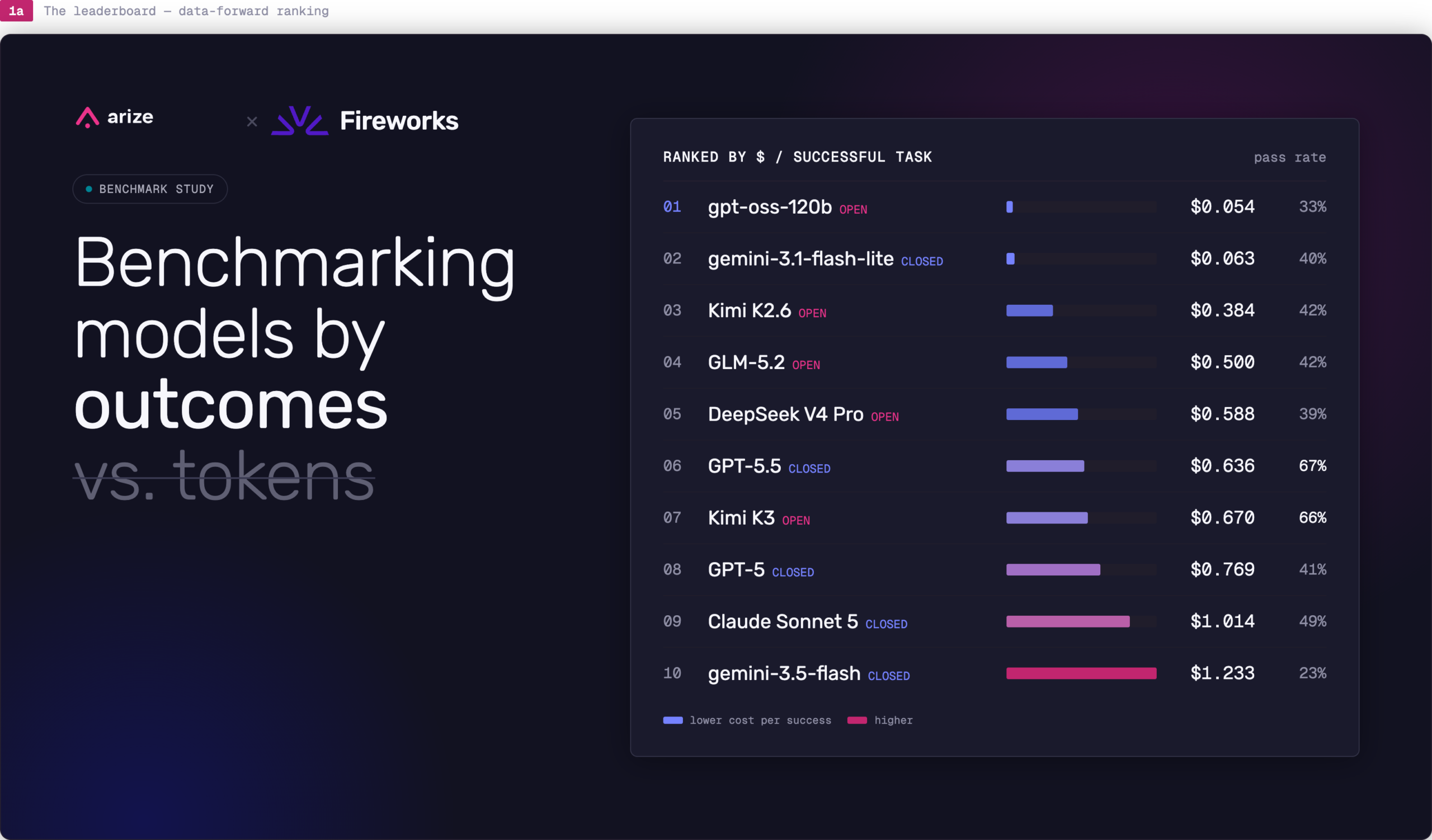
Cost per successful task: Benchmarking Kimi K3, GPT-5.5, and 8 more AI models
Arize and Fireworks benchmarked 10 AI models across 2,400 agent runs. Learn why cost per successful task beats token price for model evaluation and routing.
Sign up for our newsletter, The Evaluator — and stay in the know with updates and new resources:
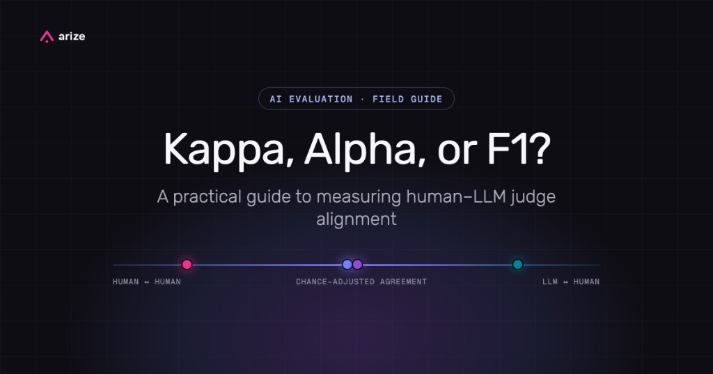
How to measure human-LLM judge alignment
No single metric proves an LLM judge is trustworthy. This field guide shows how to measure human–human agreement, compare it to LLM–human agreement, and diagnose errors with precision, recall, and F1.
How OpenAI uses human feedback to evaluate and improve LLMs
At ChatGPT scale, user frustration arrives as support tickets, ratings, social posts, and corrections buried inside conversations. OpenAI built a feedback system that can find the pattern behind a complaint, retrieve the evidence around it, and send an agent toward the code.

Inside Cursor’s agent factory: how it verifies AI-written code
As background agents take on more implementation work, Cursor is rebuilding the software development lifecycle around risk scores, developer-like environments, video evidence, and review systems that learn from every human correction.
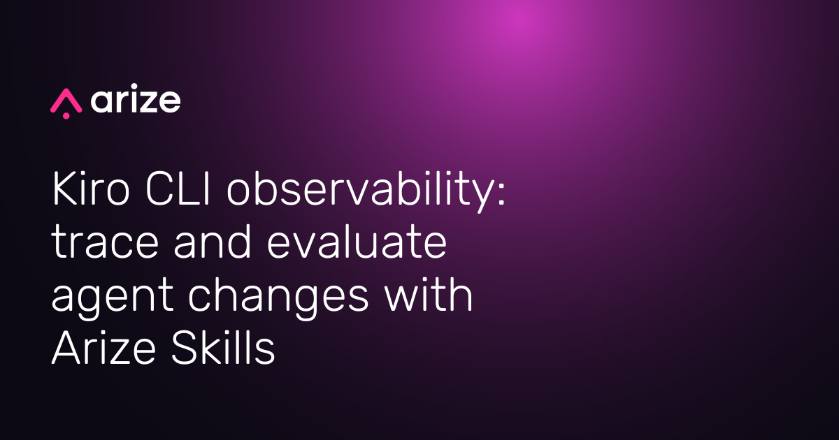
Kiro CLI observability: trace and evaluate agent changes with Arize Skills
Use Arize Skills with Kiro CLI to trace coding-agent changes, build datasets from failures, run experiments, and validate prompts before shipping.
From human-operated agent development to systematic agent improvement
At Observe 2026, Jason Lopatecki and Aparna Dhinakaran described the shift from human-operated agent development to systematic agent improvement—and what builders should change in their stacks first.
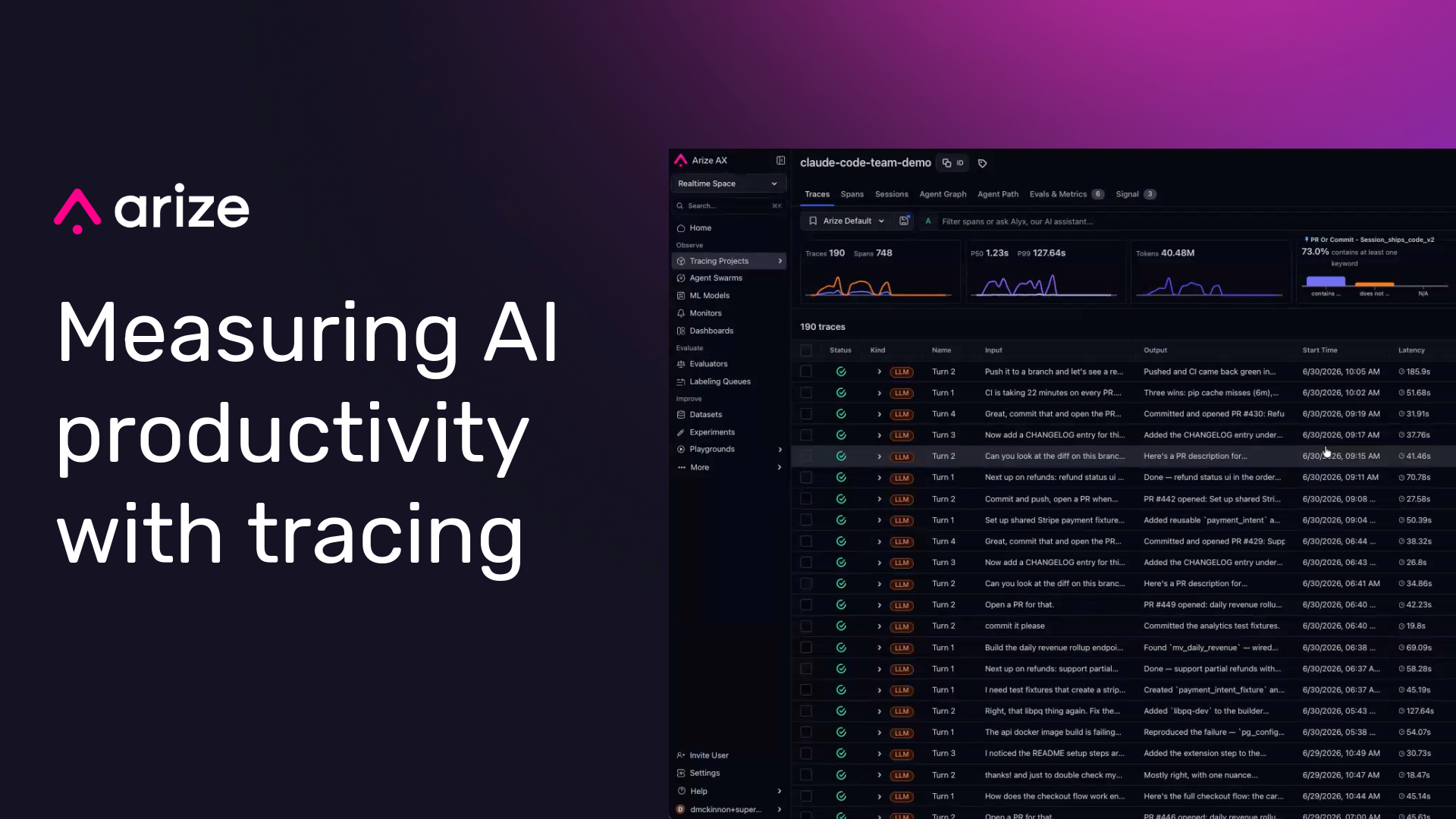
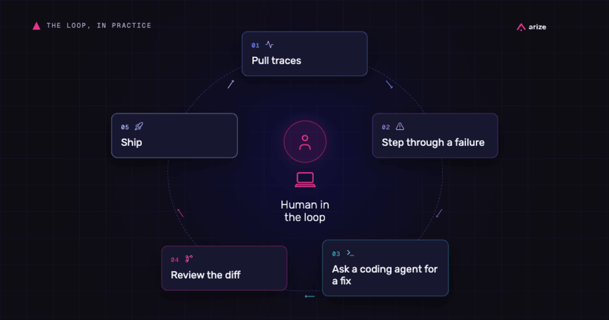
How to measure AI productivity: From LLM token costs to business value with Arize AX
AI productivity is best measured by connecting AI usage to validated downstream outcomes. Tokens, prompts, and generated lines show activity, but they do not prove value. A better measurement model tracks the cost of AI work, scores the quality and task success of that work, then joins each trace to outcomes such as merged PRs,…
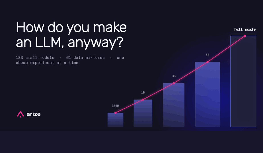
How do you make an LLM, anyway? Microsoft just published a textbook.
Microsoft published a 109-page technical report on MAI-Thinking-1. Here’s the abbreviated version of how a modern lab actually trains a frontier reasoning model — from scraping the web to reinforcement learning, judges, and anti-cheating.