How to Monitor Ranking Models
In a world filled with infinite options and finite time and resources, how do you ensure you’re providing your customers and users with the most relevant information at all times? Many companies deploy ranking models to solve this problem, aiding business-critical results across industries.
Ranking models are highly visible and provide a mutually beneficial outcome for businesses and customers yet they can equally negatively impact your business outcomes and customer satisfaction if they perform poorly. Poor-performing ranking models can lead to decreased customer satisfaction, revenue loss, and increased customer churn.
So how do you minimize prediction errors and maximize model performance to get the most out of your model? A high-performing ranking model can be your company’s golden ticket if answered correctly.
Example Use Case
Here’s an example of the impact of a low-performing ranking model impacting business outcomes:
Jeff shops on a big e-commerce website that populates a horizontal ‘For You’ list on the bottom of its home page, which recommends a list of the top 5 items Jeff might purchase. He primarily purchases video games, gaming accessories, and various household supplies – seldomly deviating from his usual purchases. Jeff often purchases many of the ‘For You’ recommendations and finds his recommendations relevant and helpful.
Over time, however, Jeff notices fewer relevant items in his ‘For You’ recommendations. He eventually gives up, realizing that the ‘For You’ section is no longer tailored to his interests – and ignores it. Jeff spends less money on this site and is less pleased with his overall experience.
So, what happened? To understand where this error occurred, we must understand how ranking models work.
How Ranking Models Work
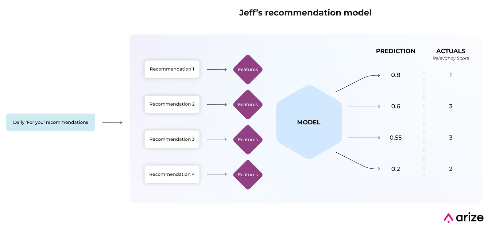
A ranking model produces a list of ordered scores based on user actions that it is trying to predict, such as clicks, favorites, or purchases. Each score is generated on its own set of features – acting as sub-predictions within the overall model. The complexity within a ranking model makes failures notably challenging to pinpoint as a model’s dimensions expand per recommendation.
ML Observability For Ranking Models
The many dimensions of a ranking model are undeniably complex since ranking models output multiple results, each trained on unique features. In other words, each prediction within a ranking model acts as a model within a model. Data quality issues, poor performing segments, and the cold start problem are a few issues within a ranking model that can be notably challenging to pinpoint without additional tooling.
Machine learning (ML) observability enables ML practitioners to minimize prediction errors and maximize model performance even for the most complex ranking model. Leverage ML observability to proactively alert on performance degradation and automatically reveal the worst-performing features and slices impacting your model performance. The ideal ML observability solution helps you root cause and improve models in a few steps, so you can find the needle in the haystack and resolve model issues in a few minutes rather than weeks.
Monitoring Ranking Models
To find where our problems are within a model, we first have to identify when our problems occur by monitoring our model with an evaluation metric, more specifically, a rank-aware evaluation metric. A rank-aware evaluation metric gauges:
- Rank order; and
- Relevancy of predictions.
Let’s see how rank-aware evaluation metrics weigh prediction attributes differently. Learn how to calculate rank-aware metrics with this helpful guide.
The following sections include a few keywords to understand.
- Training: A high-performing dataset used to train a model and is often used as a baseline to compare against production performance. You can use datasets from any environment as your baseline: training, validation, or production data from a different time period.
- Production: Inferences produced by the model as it encounters data in the real world – i.e. production – in our example, the model is problematic in production, as it’s generating recommendations that are decreasingly relevant for the customer.
- Monitoring Threshold: A predetermined value that informs when a monitor triggers an alert. A threshold is determined by looking back at a historical time window for a metric and calculating the variance of data in that time period.
- Triggered Alert: A notification generated when an evaluation metric exceeds the monitor’s threshold. Alerts contain valuable model metadata based on your evaluation metric for faster root cause analysis.
Mean Reciprocal Rank (MRR)
MRR calculates the mean of the first relevant recommendation, evaluating how well your algorithm predicts your first relevant item. MRR is best for targeted search recommendations since it only considers the first relevant prediction in a list.
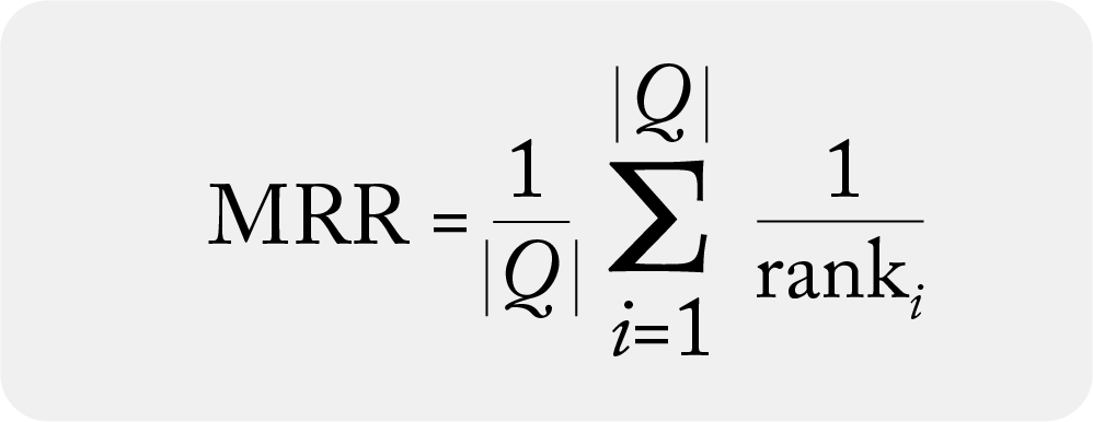
MRR is the summation of relevant prediction within a list divided by total number of recommendations
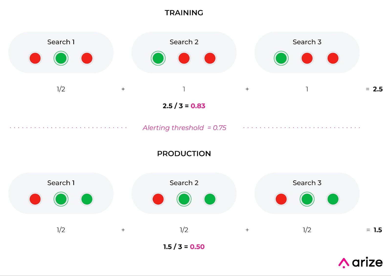
Example: Sponsored items at the top of a search query. Use MRR to ensure your sponsored item is the first relevant recommendation within a list. In the example below, even though the training dataset has fewer overall relevant predictions than the production dataset, MRR is higher for training than production. This is because the training dataset has more relevant first predictions. While this is a limitation of MRR, MRR provides direct feedback to easily understand your first relevant prediction.
Mean Average Precision (MAP)
MAP approximates the area under the precision-recall curve, resulting in a singular metric to better compare multiple ranking systems. MAP weighs errors to account for value differences between the top and bottom of the list but is limited to binary relevancy (relevant/non-relevant) and can not account for order-specific details.
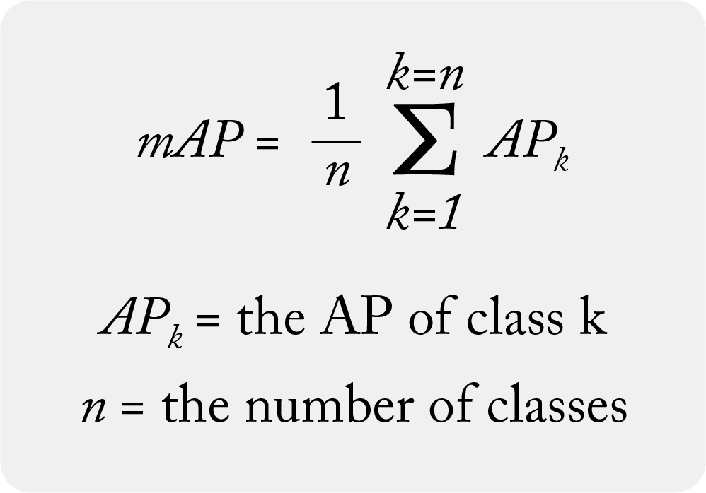
MAP is the summation of the average precision within a list divided by total relevant recommendations
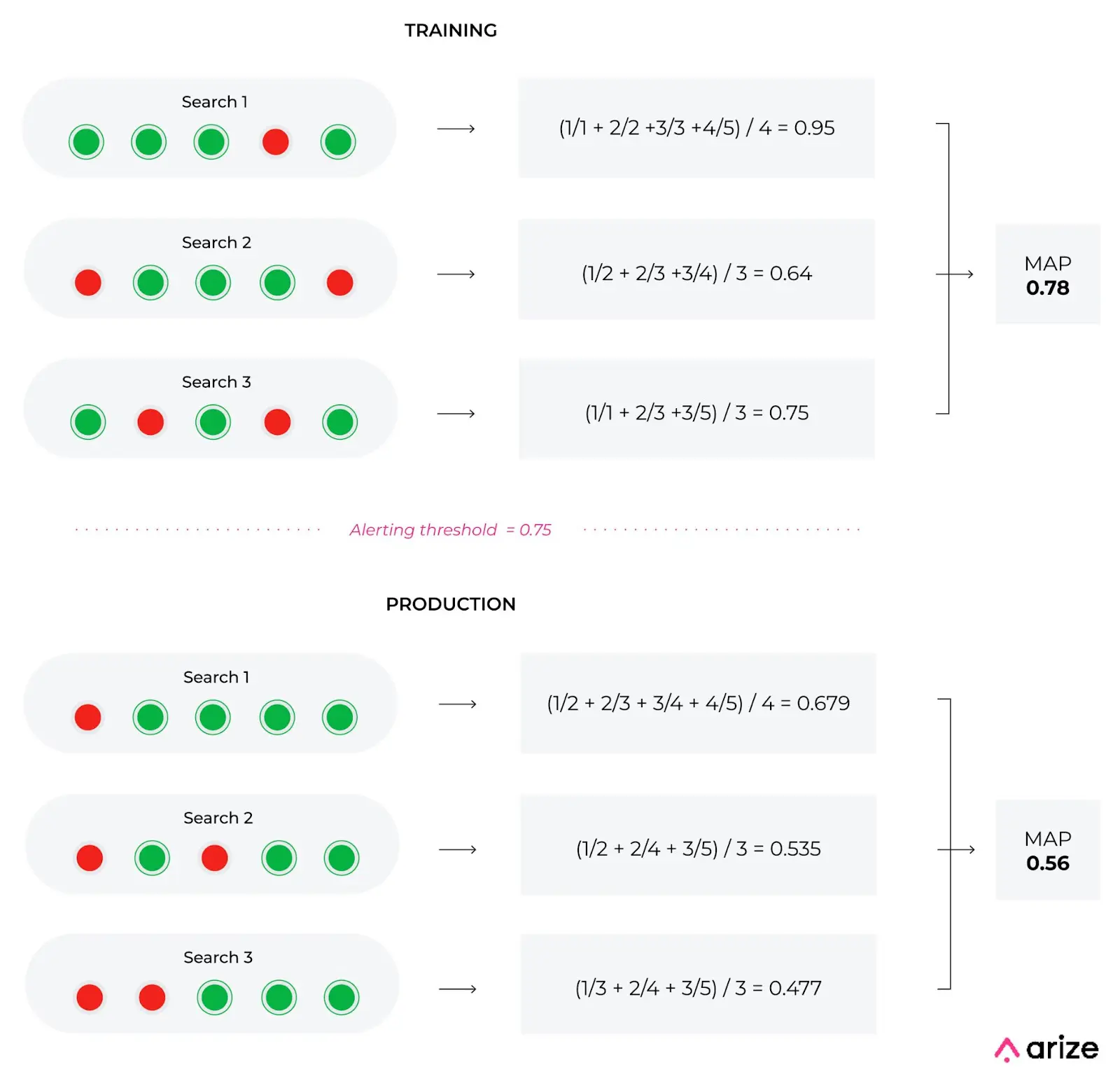
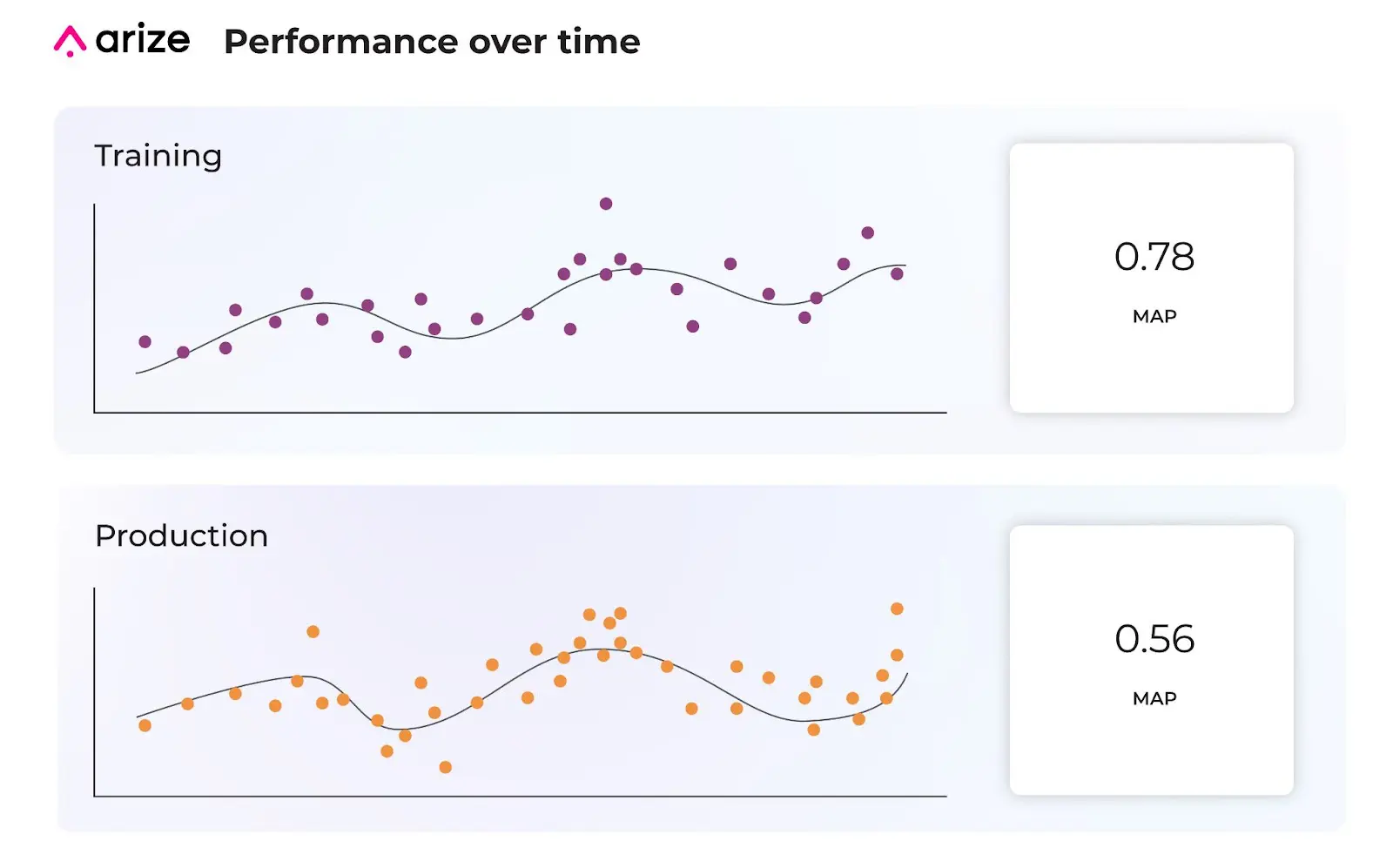
Example: Jeff’s top five “For You” items. Even though each dataset in the example includes the same number of relevant predictions, the recommendations are ordered differently between training and production. Here we can see MAP favors predictions higher on a list, with a difference of 0.22 between training and production. MAP is advantageous when additional relevancy data is unavailable or too messy, resulting in a faster understanding of your model’s performance to ensure highly visible predictions, like Jeff’s “For You,” remain relevant.
Normalized Discounted Cumulative Gain (nDCG)
nDCG is similar to MAP but is more sensitive to rank order. nDCG provides the ability to fine-tune which ranks are more valuable than others, and account for a scale of relevancy scores (graded relevance). While nDCG overcomes the shortcomings of MAP, nDCG is limited by actual data and partial feedback and thus requires a more manual data-cleaning process for an accurate calculation.
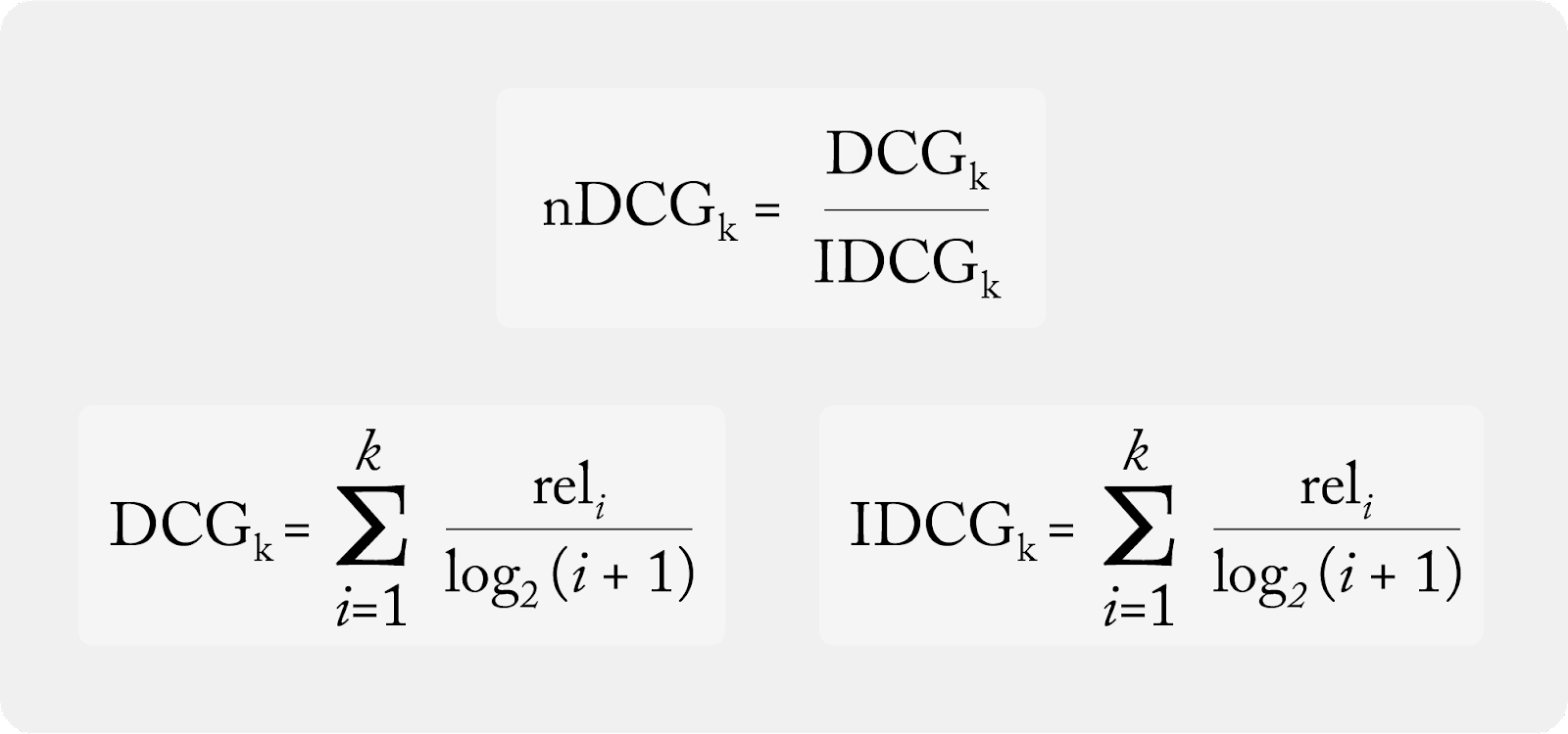
nDCG is the quotient of DCG and IDCG
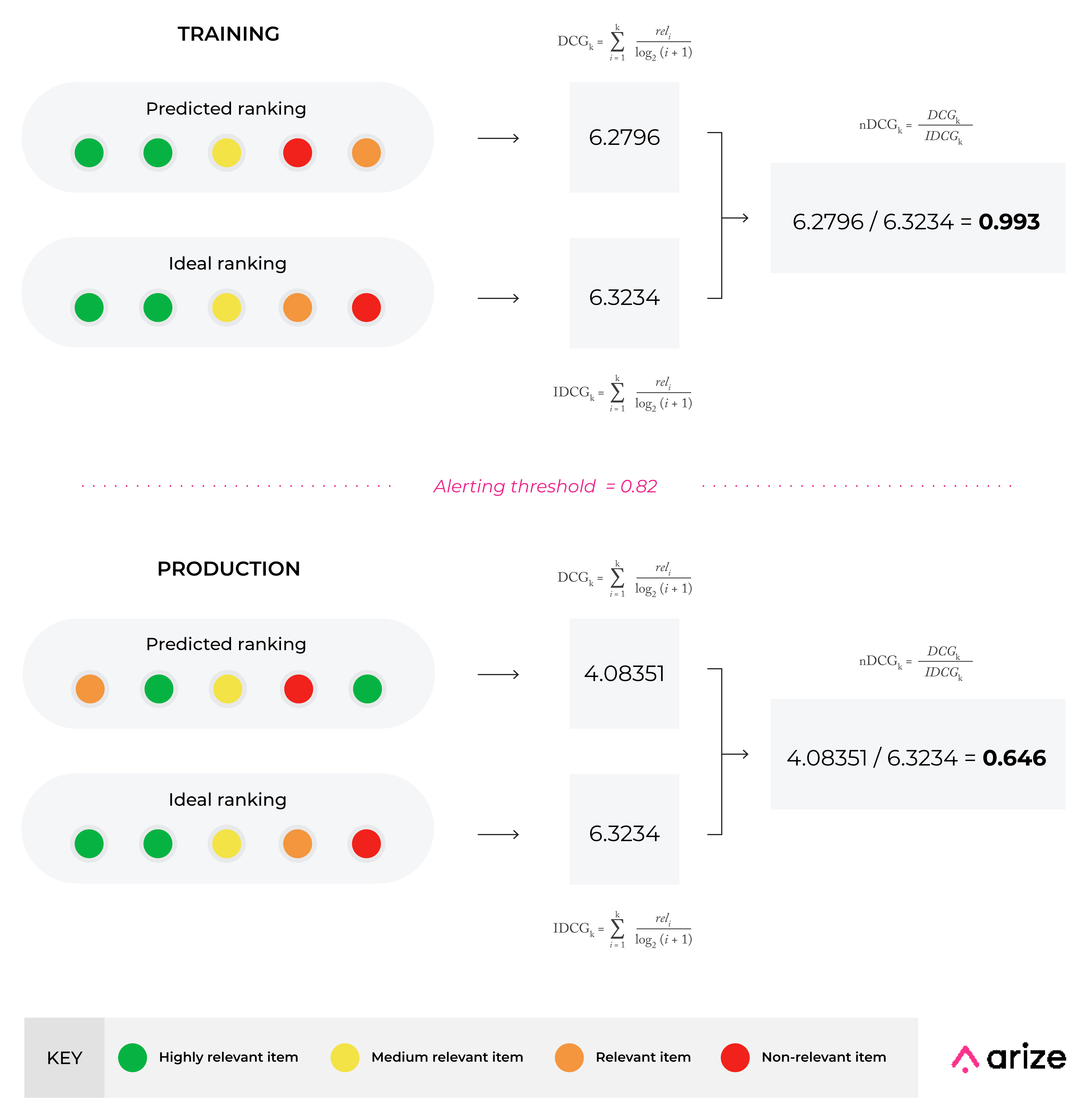
Example: Organic search results (i.e., when Jeff searches ‘desk accessories’). nDCG helps ensure the most relevant items are shown at the top of the search result in descending order. While the datasets are nearly identical, the first and last recommendations are switched in the production dataset. This results in a significant difference between the two datasets, dropping nDCG from 0.993 to 0.646. nDCG is the most sensitive rank-aware metric to overall graded order and is favorable for cases when you can receive full relevancy feedback.
Performance Tracing Best Practices
Once we know when our model runs into problems, we can start performance tracing to uncover the where and why of our performance issues in a few easy steps.
First, we’ll evaluate our performance over time by comparing our model’s alerted production data with previous high-performing data. This comparison allows us to better understand problematic areas within our production model by uncovering where our data fails between the two datasets.
Using the MAP example above, we’ll compare our current production data to a prediction time period of high performance, in this case, prior training data. Our MAP diagram indicates MAP = 0.78 for training, with an alerting threshold of 0.75, so anything below 0.75 indicates a performance degradation with our model.
From there, we dive into subsets within our data to surface the feature slices that contribute to performance degradation from worst to best. Since ranking models have thousands of features with dozens of categories, performance insights help streamline the feature exploration process so you no longer have to dig for the needle in the haystack.
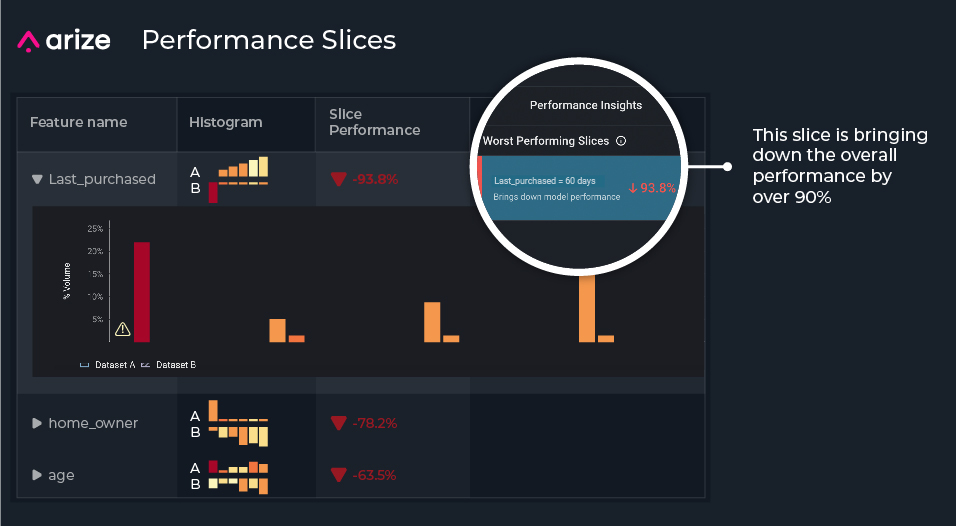
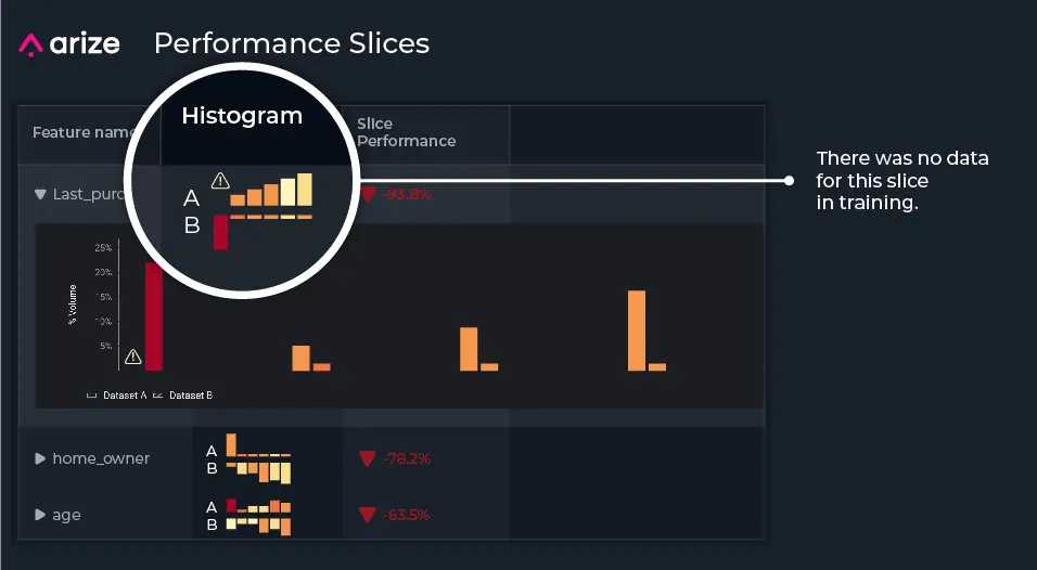
For our example, when narrowing in on the top slices affecting our model performance, we notice the slices last_purchased = 60 days, home_owner = owns, and age = college_age contribute to performance degradation the most. When we zoom into each feature, we notice a lot of missing training data compared to production data, where our production model is predicting on slices that it’s never seen in training.
Now that we’ve uncovered where our model is not performing well, let’s discover why. Since features can change in real life, especially features based on constantly changing consumer behavior, our user group behavior has likely shifted significantly since the last time we trained our example model – which has led to the drastic changes we see in Jeff’s recommendations.
For our model, we want to know all features that have changed concerning our comparison dataset. To do this, we can click into our worst-performing slices and analyze feature drift. We can evaluate our feature drift over time and our distribution comparison to better understand the facets of our model that failed.
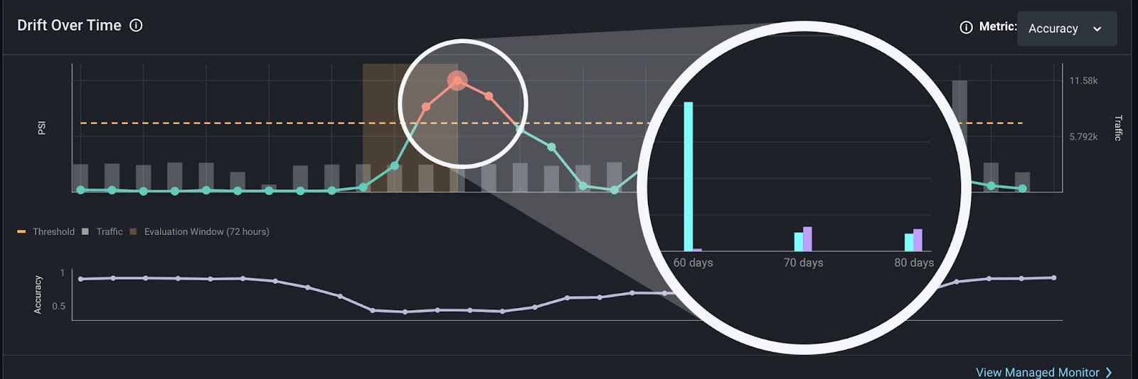
This zoomed-in view of our features shows missing values for our most problematic slice (last_purchased = 60 days), which is caused by feature drift.
From there, we can retrain our model by upsampling the missing features, create new features based on this drift, or even train a new model. In any case, we are now able to proactively catch performance degradation with an appropriate rank-aware evaluation metric, identify the worst performing features and slices, and easily root cause our model issues.
Note: The model used for Jeff’s recommendations produces actuals, so we can pick a rank-aware evaluation metric and utilize performance tracing. Even if your ranking model has delayed actuals, you can still leverage the power of ML observability with model drift monitoring and data quality monitoring to efficiently fix your model issues in real time.
Conclusion
Ranking models can fail spectacularly, so it’s important to proactively monitor and improve your model’s performance. Understand the many facets of even your most complex model with ML observability to minimize prediction errors, maximize model performance, and safeguard your company’s golden ticket.
Ready to get started? Sign up for a free account, join the Arize community or schedule a demo with our team today.
