Documentation Index
Fetch the complete documentation index at: https://arize-ax.mintlify.dev/docs/llms.txt
Use this file to discover all available pages before exploring further.
Widget Overview
Dashboard widgets are the individual tiles that help create a dashboard view. Widgets provide an easy way to customize dashboards and perform ad hoc analysis. They can be used to build dashboards from scratch, or as a way to modify templated dashboards.Widget Types
Click in each card to learn more about how to use each widget typeTime Series 📈
- Correlate a feature over time: compare to a feature/tag value - Track key slice performance: a granular view of model performance
Distribution 📊
- Analyze top performing features with data quality metrics - Evaluate the heat map: Performance across distributions - Compare predictions vs actuals
**Statistic** ➕
- Highlight key performance metrics: for any model type, pair this with time series graphs for a single-pane-of-glass view of model health
Drift 🌊
- Identify gradual changes over time: measure drift for any model dimension
Alert Graph 🔔
- Visualize sudden model changes
- General check: combine business-critical monitors across various models in 1 dashboard
Text 📰
- Annotate Dashboards: add helpful notes and metadata to share across teams
Time Series
📈 Correlate a Feature Over Time
📈 Correlate a Feature Over Time
Begin with an existing dashboard, blank dashboard, or start with a created templateEnter edit modeSelect or Drag ‘Timeseries’ widget square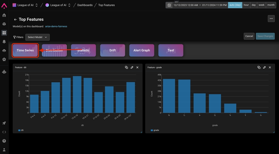 Define a the plot by specifying what metric you’d like to see, which Feature / Tag / Actual / Prediction Value you’d like to see first.Overlay important metadata like tags by toggling on “Group metric by feature or tag”Enjoy your powerful dashboard view!
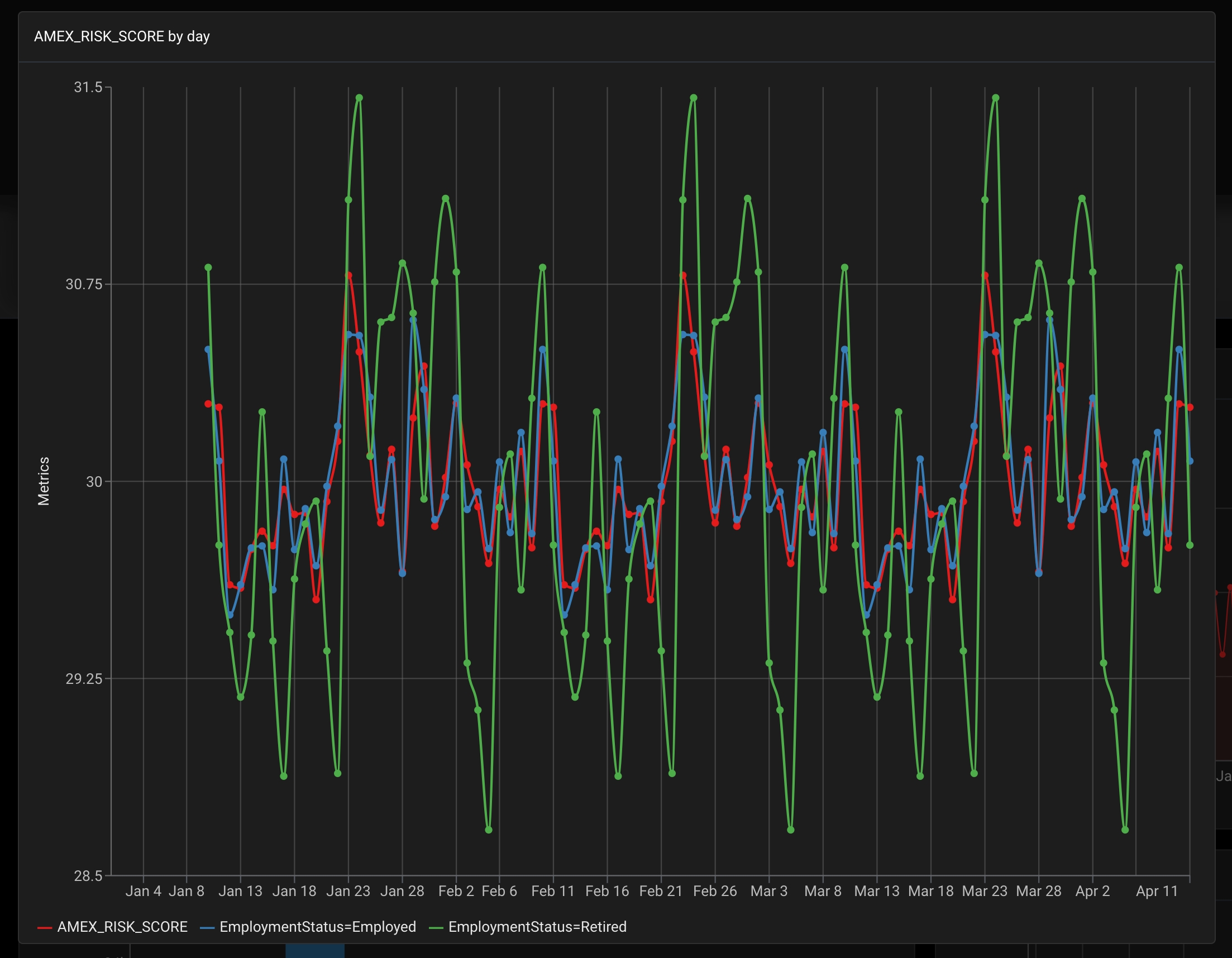
Define a the plot by specifying what metric you’d like to see, which Feature / Tag / Actual / Prediction Value you’d like to see first.Overlay important metadata like tags by toggling on “Group metric by feature or tag”Enjoy your powerful dashboard view!🏁 Track Key Slice Performance
🏁 Track Key Slice Performance
How to create a widget within a dashboard that shows key slice performance over timeBegin with an existing dashboard, blank dashboard, or start with a created templateEnter edit modeSelect or Drag the Time Series widget creation buttonDefine the first plot by specifying the model, what metric you’d like to see, and the model environment: Production, Pre-production (Validation or Training) and version if applicable.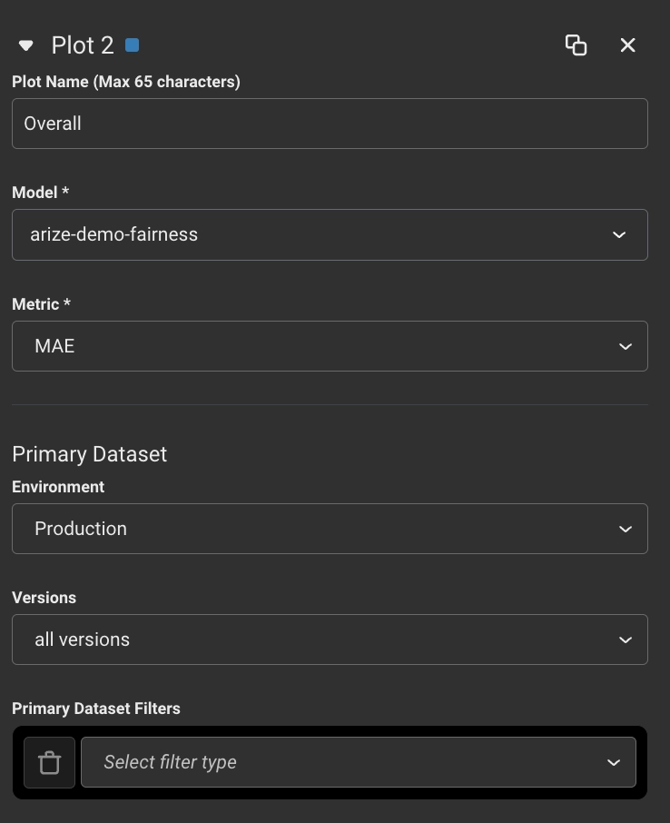 Duplicate the plot to quickly start defining your 2nd plot
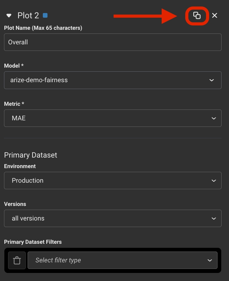 Add a filter to specify the slice in the 2nd plot
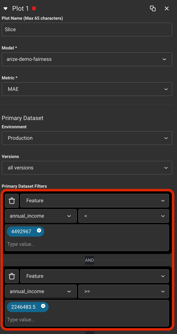 Success!
Duplicate the plot to quickly start defining your 2nd plotAdd a filter to specify the slice in the 2nd plotSuccess!Distribution
🧠 Analyze Top Performing Features
🧠 Analyze Top Performing Features
How to create a widget within a dashboard that analyzes your top performing featuresBegin with an existing dashboard, blank dashboard, or start with a created templateEnter edit modeSelect or Drag the Distribution widget creation buttonDefine the first plot by specifying the model, what metric you’d like to see, model environment: Production, Pre-production (Validation or Training), version (if applicable) and what (features, actuals, predictions, etc) you will be displaying the “distribution over”.💡 This example uses feature whose data type is numeric distribution. If you chose a feature whose data type is string, the values will be bucketed by that dimension’s values instead of it’s numeric ranges.Success!
🔥Evaluate Performance Across Distributions with Heatmaps
🔥Evaluate Performance Across Distributions with Heatmaps
How to create a widget within a dashboard where you can evaluate a heatmap of performance across distributionsBegin with an existing dashboard, blank dashboard, or start with a created templateEnter edit modeSelect or Drag the Distribution widget creation buttonDefine the base plot by specifying the model, what metric you’d like to see, model environment: Production, Pre-production (Validation or Training), version (if applicable) and what (features, actuals, predictions, etc) you will be displaying the “distribution over”.🔥Overlay performance information by selecting a performance metric in the Color By dropdown.💡 If the metric requires additional information like Positive Class or at K value, fill out those appropriate fields to get your finalized chart!Success!
📊Compare Predictions vs Actuals
📊Compare Predictions vs Actuals
Begin with an existing dashboard, blank dashboard, or start with a created templateEnter edit modeSelect or Drag the Distribution widget creation buttonDefine the first plot by specifying the model, what metric you’d like to see, model environment: Production, Pre-production (Validation or Training), version (if applicable) and what (features, actuals, predictions, etc) you will be displaying the “distribution over”. In this case, we’re looking at Prediction Class💾Duplicate the plot in the plot menu to quickly start defining your 2nd plot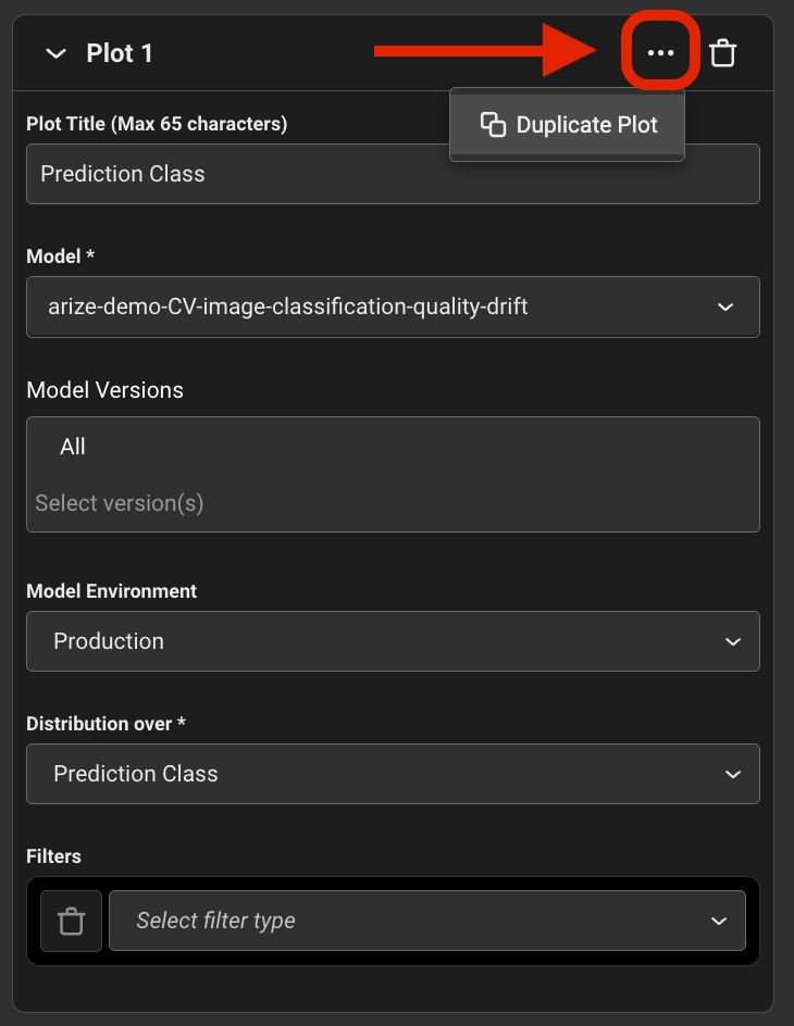 Update the second plot to Actual Class to specify what the second plot will be distributing over💡 Further narrow down a plot by adding filters to specify problematic features within the main querySuccess!
Update the second plot to Actual Class to specify what the second plot will be distributing over💡 Further narrow down a plot by adding filters to specify problematic features within the main querySuccess!Statistic
🔑 Highlight Key Performance Metrics
🔑 Highlight Key Performance Metrics
Begin with an existing dashboard, blank dashboard, or start with a created templateEnter edit modeSelect or Drag ‘Statistic’ widget square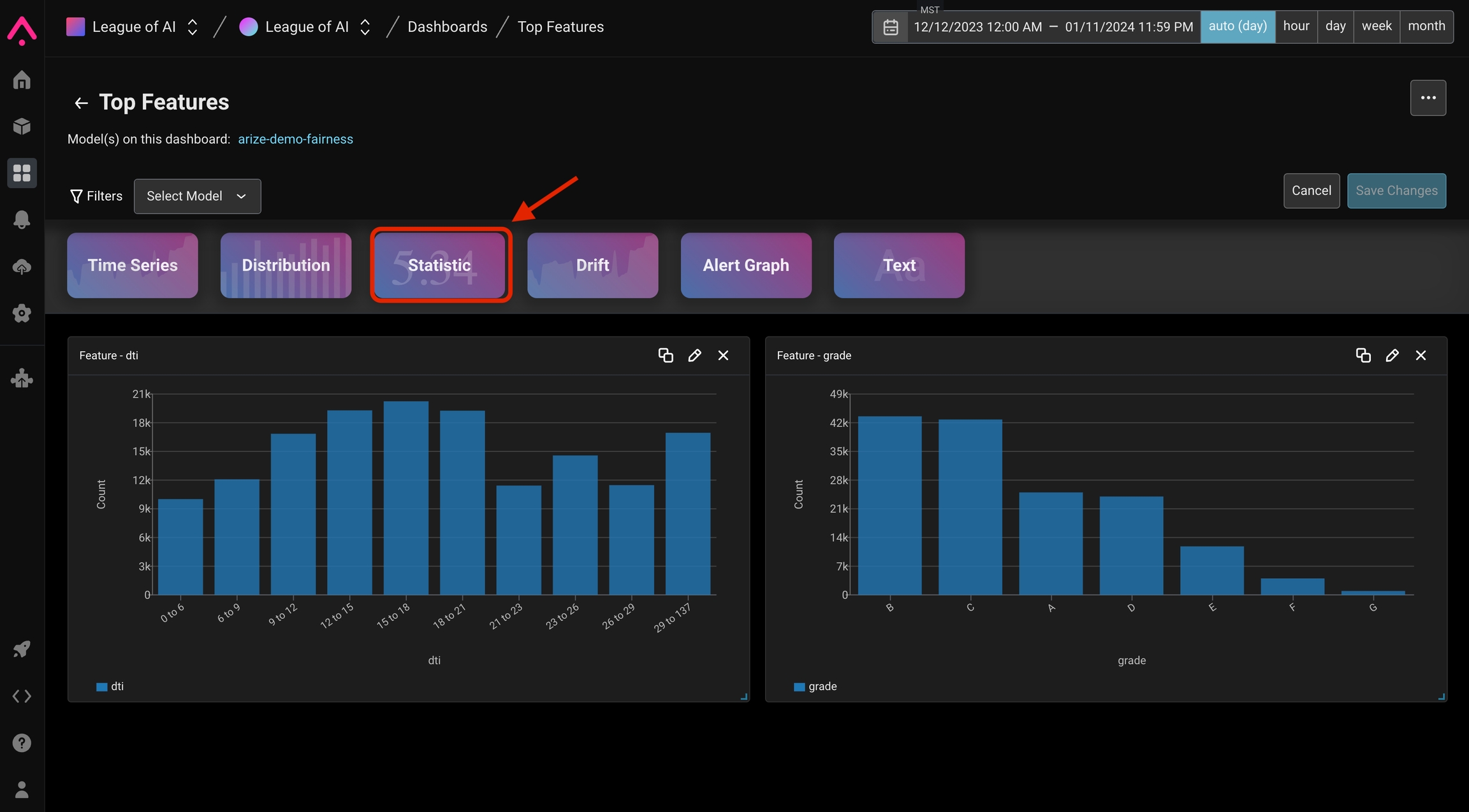 Define the widget by specifying the evaluation/performance metric. Then define the rest of the dataset by specifying model, what metric you’d like to see, model environment: Production, Pre-production (Validation or Training), version (if applicable).💡 To narrow down on this metric for a given features / actuals / predictions, etc add filters on the primary datasetSuccess!
Define the widget by specifying the evaluation/performance metric. Then define the rest of the dataset by specifying model, what metric you’d like to see, model environment: Production, Pre-production (Validation or Training), version (if applicable).💡 To narrow down on this metric for a given features / actuals / predictions, etc add filters on the primary datasetSuccess!Drift
🔔 Identify Feature Changes Overtime
🔔 Identify Feature Changes Overtime
Begin with an existing dashboard, blank dashboard, or start with a created templateEnter edit modeSelect or Drag ‘Drift’ widget square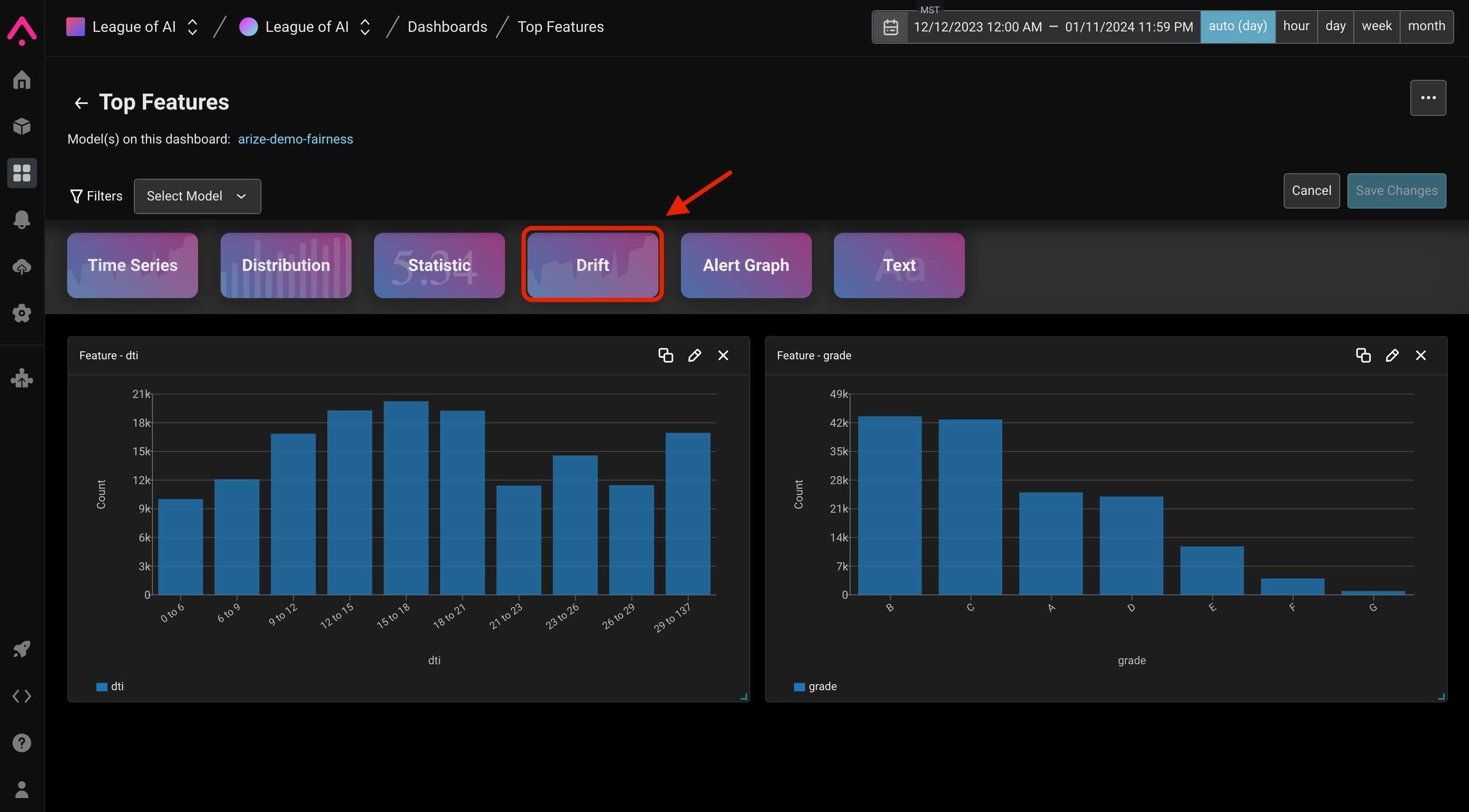 Select the model dimension to measure such as prediction/actual and feature/tag drift
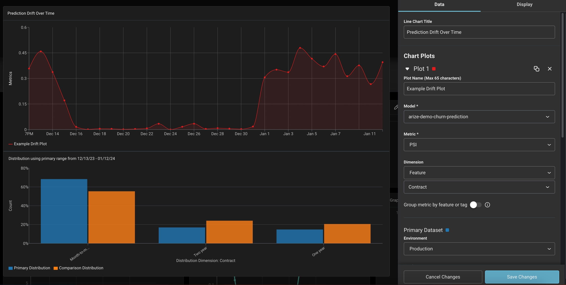 ❗Pro Tip: Gain a more granular view of how each slice impacts your metric by grouping your feature/tag
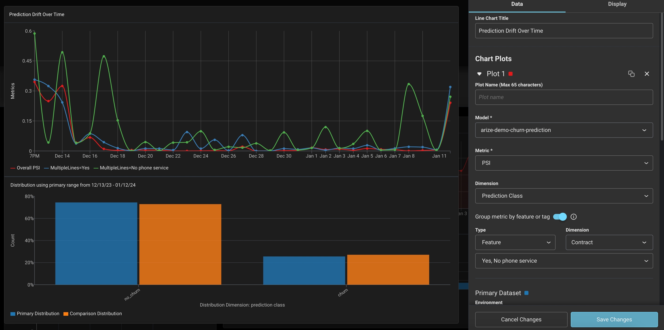 Success!
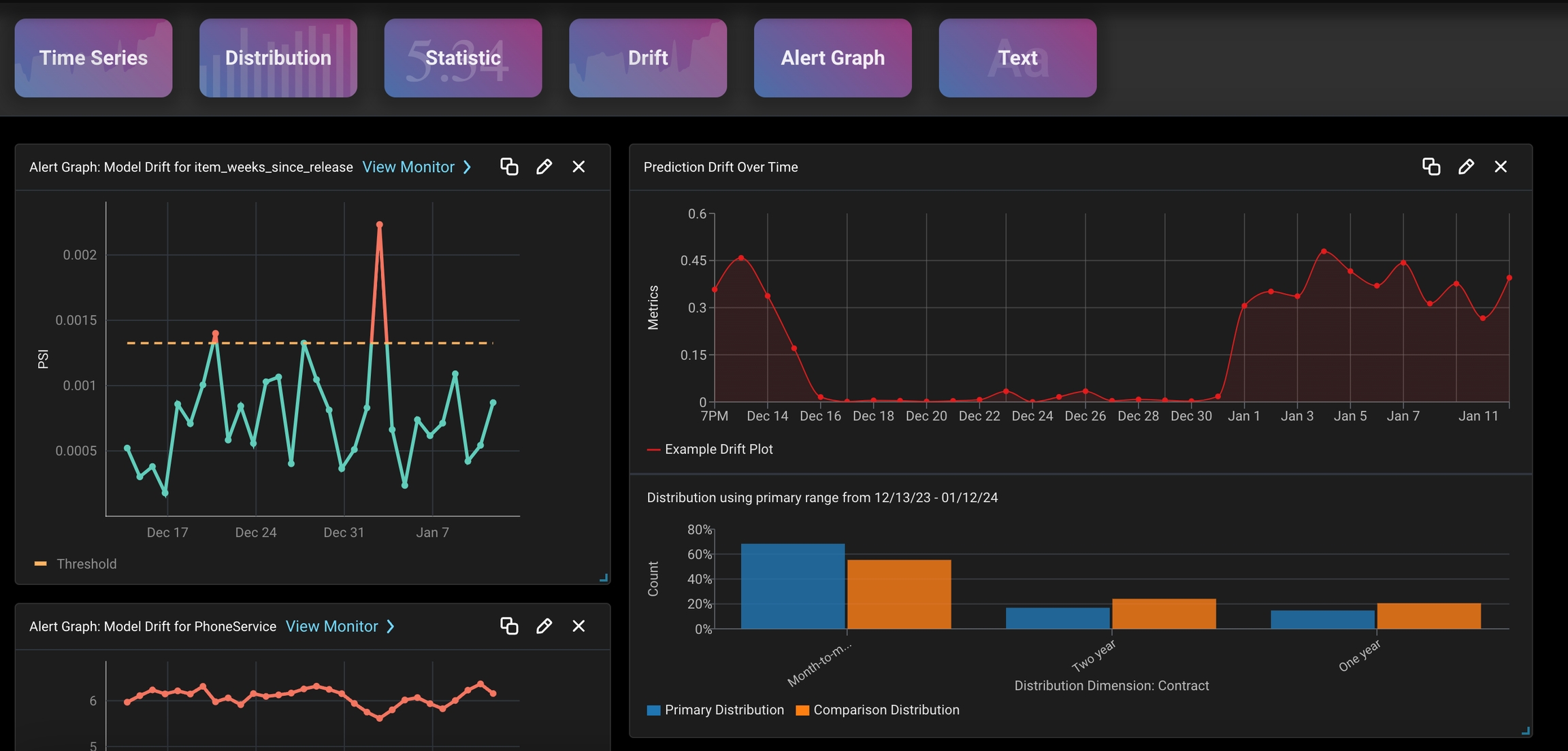
Select the model dimension to measure such as prediction/actual and feature/tag drift❗Pro Tip: Gain a more granular view of how each slice impacts your metric by grouping your feature/tagSuccess!Alert Graph
📉 Visualize Sudden Model Changes
📉 Visualize Sudden Model Changes
Begin with an existing dashboard, blank dashboard, or start with a created templateEnter edit modeSelect or Drag ‘Alert Graph’ widget square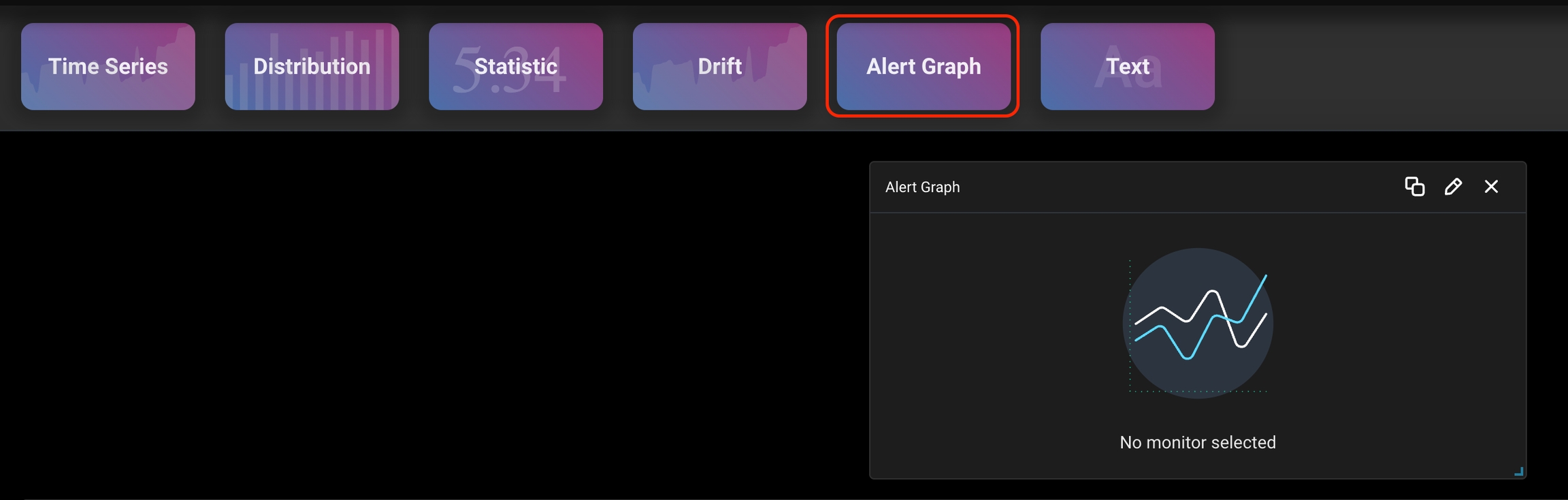 Select a prediction drift and feature drift monitors for your model
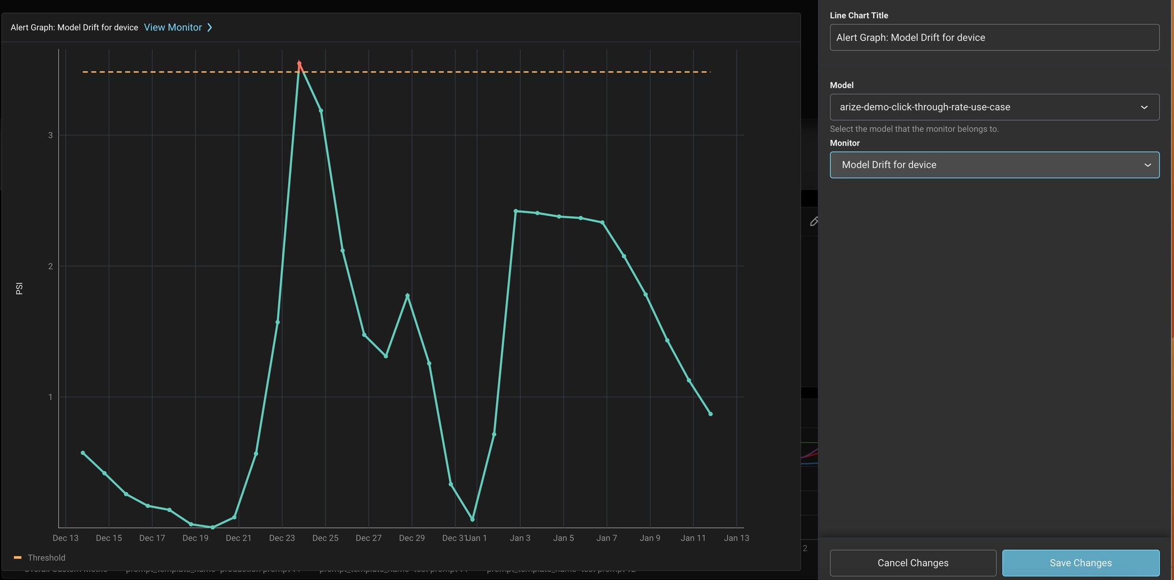 Save, share, and troubleshoot by clicking the ‘View Monitor’ link.
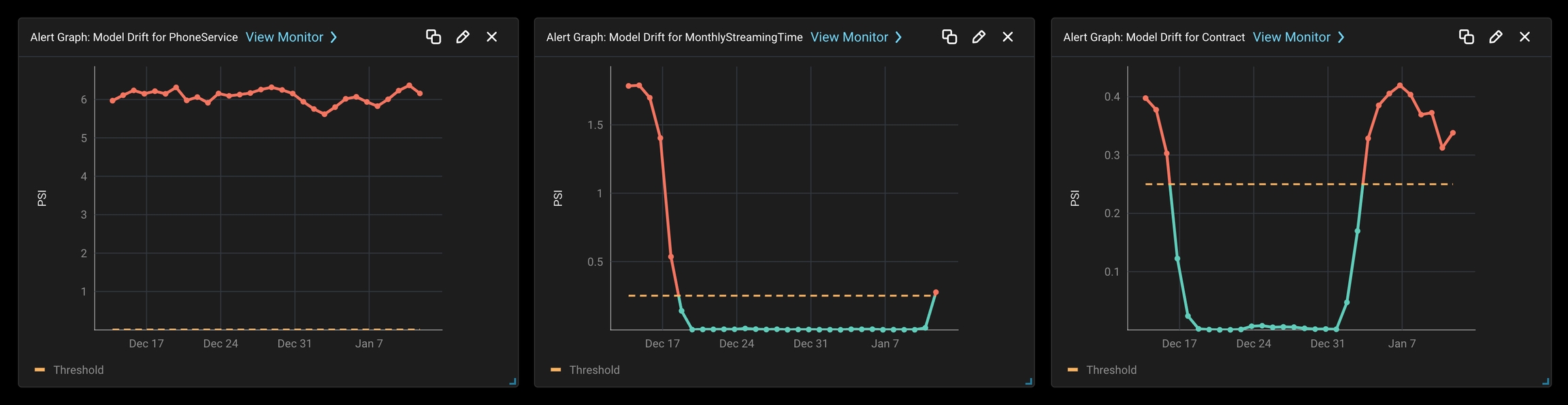 ❗Pro Tip: Learn how to troubleshoot drift monitors here.
Select a prediction drift and feature drift monitors for your modelSave, share, and troubleshoot by clicking the ‘View Monitor’ link.❗Pro Tip: Learn how to troubleshoot drift monitors here.🏥 General Model Health Check
🏥 General Model Health Check
Begin with an existing dashboard, blank dashboard, or start with a created templateEnter edit modeSelect or Drag ‘Alert Graph’ widget squareSelect various model monitors that can significantly impact KPIs or are sensitive to change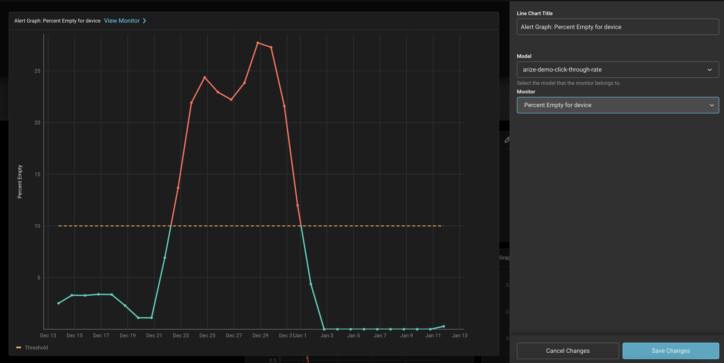 Save, share, and troubleshoot by clicking the ‘View Monitor’ link.
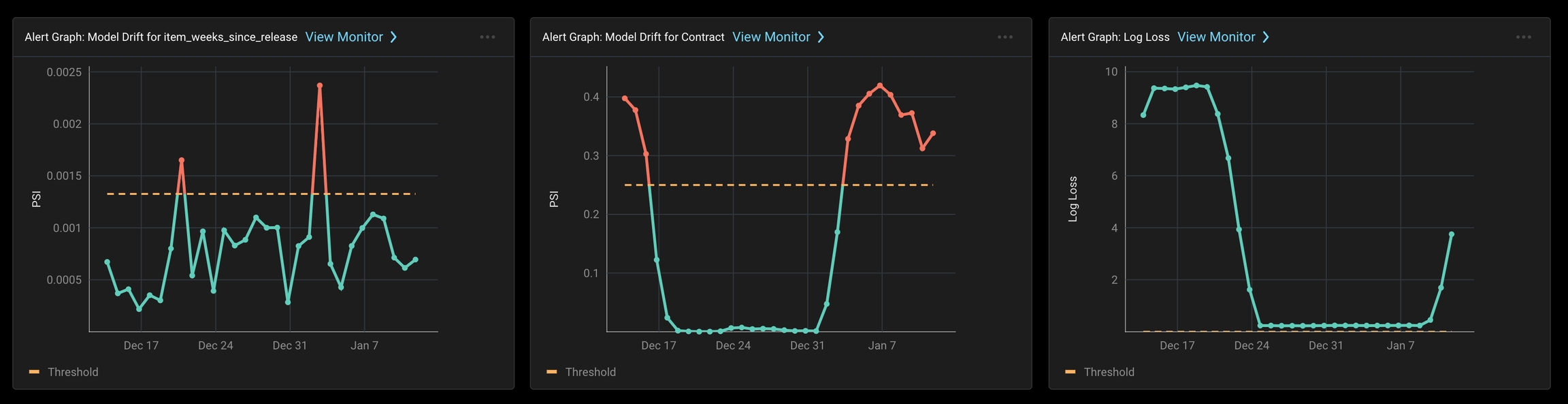
Select various model monitors that can significantly impact KPIs or are sensitive to changeSave, share, and troubleshoot by clicking the ‘View Monitor’ link.Text
✍️ Annotate Dashboard With Metadata
✍️ Annotate Dashboard With Metadata
Begin with an existing dashboard, blank dashboard, or start with a created templateEnter edit modeSelect or Drag ‘Text’ widget square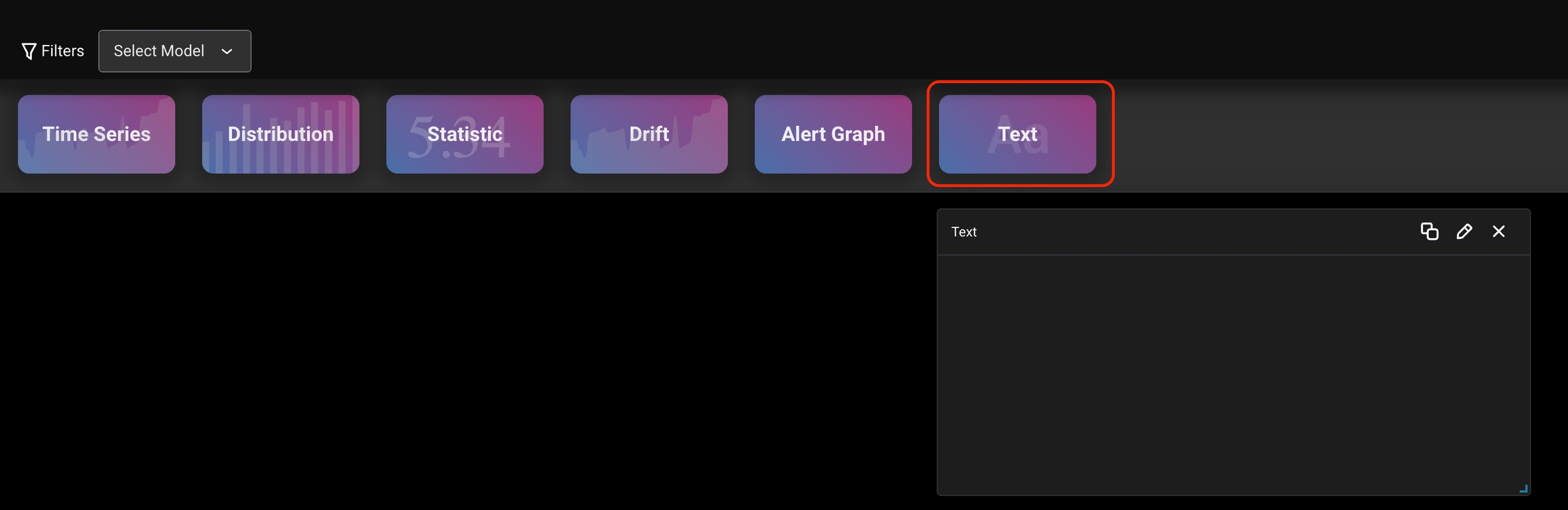 Type useful notes and other relevant text
 Enjoy your powerful dashboard view!
Type useful notes and other relevant textEnjoy your powerful dashboard view!Questions? Email us at support@arize.com or Slack us in the #arize-support channel